
TL;DR
Test real sample swatches on your own walls before you commit, because Philly rowhouse light changes a color hour to hour. Pull your palette from what's already in the room, learn to read undertones, and keep trim and sightlines consistent so an open floor plan flows. Still stuck? We bring samples to you.
In This Article
Choosing the right paint color for a Philadelphia home is one of the most common things homeowners get stuck on. Between rowhouse light, historic architecture, and a wall of a thousand chips at the store, it's easy to freeze. The trick is to stop shopping for a color and start reading your own room. A few rules narrow it down fast.
Start With the Light in Your Room
Light does more to a paint color than the color itself does. A chip that looks like a warm greige under the store's fluorescents can turn flat and gray in a north-facing Philly living room. So before anything else, figure out which way your windows face. North-facing rooms get cool, steady light all day and push colors bluer, so warm them up. South-facing rooms get strong warm light that can make an already-warm color feel yellow. East rooms are bright in the morning, west rooms glow in the late afternoon.
A lot of older Philadelphia homes, especially trinity houses and interior rowhouse rooms, only have windows on one wall. Those middle rooms fight for daylight. Lighter values, even warm ones, keep them from feeling like a cave.
Then there's your bulbs. A 2700K "warm white" LED throws yellow and flatters beiges and creams. A 4000K "cool white" bulb reads almost blue and can make the same wall look sterile. Test your samples under the actual bulbs you live with, not just daylight.
Pull From What's Already in the Room
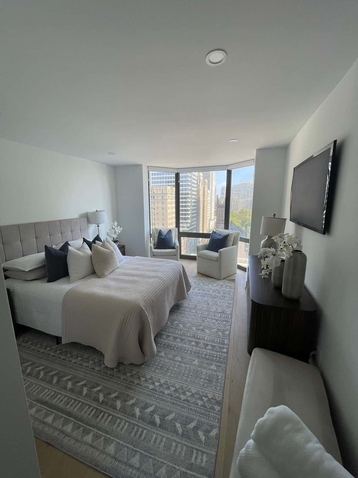
Your furniture, rug, floors, and art already contain a palette somebody curated for you. Use it. Pull a quieter color out of the rug for the walls. Match the undertone in your wood floors so they don't clash. Find a color you love in a favorite piece of art and build around it. Starting from what's staying in the room is a shortcut to a scheme that actually works, instead of a wall color you picked in a vacuum and now have to decorate around.
Learn to Read Undertones
Every color has an undertone hiding under the main color, and it's the thing that trips people up. A white can lean warm with yellow, cream, or pink, or cool with blue, gray, or green. A "greige" swings warm or cool depending on the light next to it. Grays are the sneakiest, a lot of them go purple or green on the wall when they looked neutral on the chip.
The educational way to see this is to compare a color against a known reference. A warm white like White Dove reads creamy and soft next to a crisp bright white, which is exactly why designers pair the two. Hold your samples next to your trim, your floors, and each other. The undertone shows up the second it has something to sit against.
Test Before You Commit
Buy two or three sample pots and paint big swatches on the actual wall, at least a foot square, ideally two coats so the true color shows. Put them on more than one wall since light hits each one differently. Then live with them. Look in the morning, at noon, and at night with the lamps on. Peel-and-stick sample sheets are great if you don't want to paint directly on the wall, and you can move them room to room. A few dollars in samples is the cheapest insurance against repainting a whole room you got wrong.
Keep the Flow in an Open Floor Plan
Philly rowhouses that have been opened up on the first floor create a problem people forget about: you can see three or four "rooms" at once from the front door. If every zone is a different color, the space feels chopped up. Pick one main wall color that carries through the connected sightlines, keep a single trim white throughout, and save your bolder colors for rooms that close off with a door. One consistent trim color across the whole house is the quiet trick that makes everything look intentional.
Be Bold Where It's Low Risk
A powder room, a small home office, the back of a built-in, or the inside of a cabinet run are all low-stakes places to try a deep color you'd be nervous about on a whole living room. Small rooms with no natural light are often better as a rich, moody color than as a sad attempt at bright, since they'll never read as airy anyway. Lean into it.
When in Doubt, Ask
Color House Painters includes color guidance with every interior painting project. We bring samples, look at your rooms in your light, and help you land on something you'll still love in two years. Call us at (215) 715-4647 to get started.

Color House Painters
Residential and commercial painters working across Philadelphia since 2015. Licensed and insured, from Center City condos to Chestnut Hill Victorians.
Call Now